Customer Client
The Customer Client is a chat and voice widget that is embeddable in websites, or available as a component of a Support Portal. The functionality and styling of the client application is customizable, and composed of standard Javascript, CSS, and HTML code. Basic configuration is available via the Customer Client administration page, while more advanced configuration can be achieved via uploading custom code files, or by manipulating elements of the client via code overrides on the website hosting the client. For advanced configuration assistance, please contact the MotionCX team.
To add or edit a customer client, navigate to Administration > Interaction Admin > Customer Client from the left navigation menu.
Add/Edit Customer Client
To create a new customer client, click the Create New Customer Client button in the top right corner of the Customer Client page. To edit an existing customer client, click the Actions button next to a customer client and select Edit.
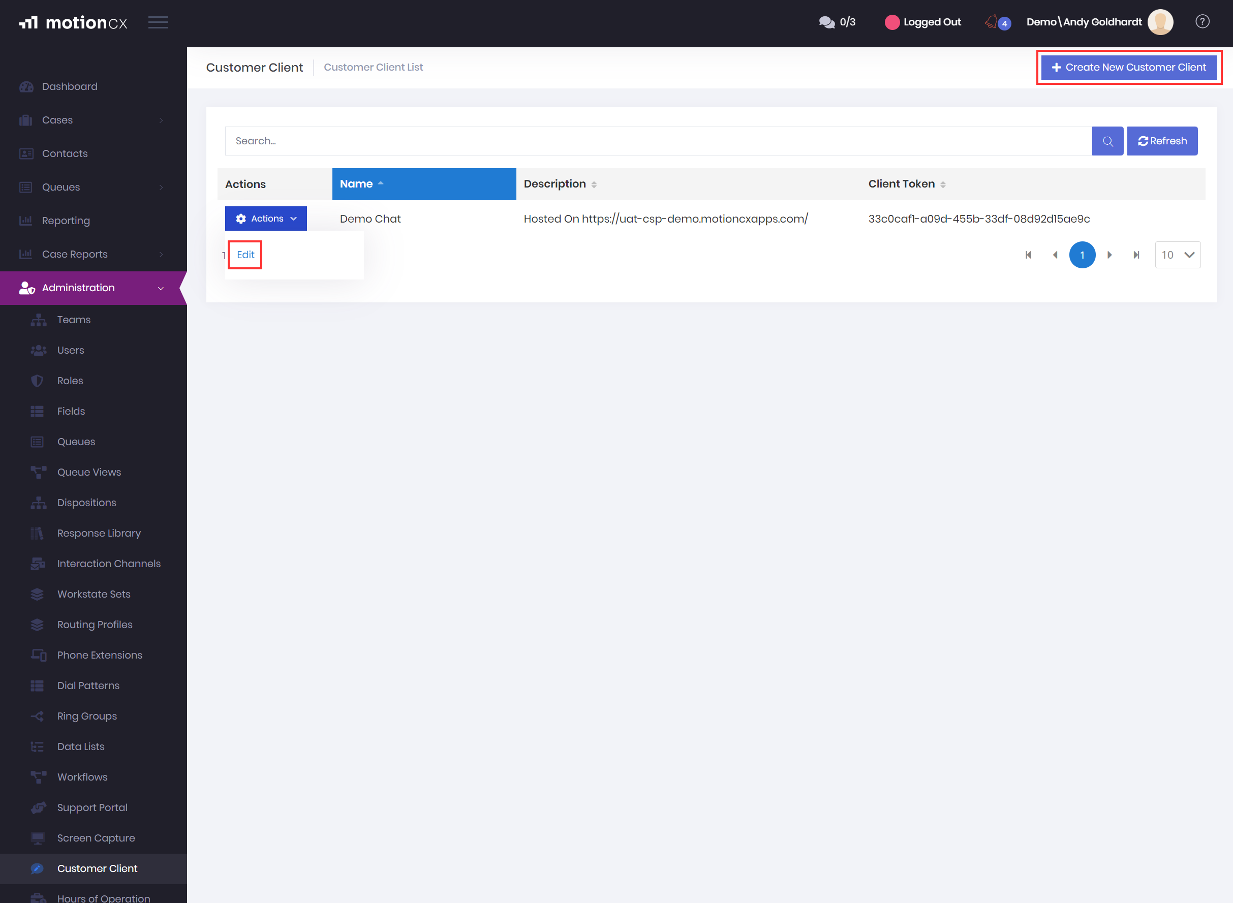
Create And Edit Customer Clients
The Create/Edit Customer Client window will contain four tabs: General, Channels, Styling, and Bot
Add/Edit Customer Client > General
The General tab is where identifying information is captured for the customer client.
-
Client Token - The client token is used to associate customer clients to a support portal. On initial creation of a customer client, the Client Token is not displayed and will only be generated on save. Once saved, the generated Client Token will display on the customer client and Customer Client list.
-
Client Token Alias - This is a definable replacement value for the Client Token that is primarily in place to support legacy customers and is not needed for new configurations.
-
Name - A friendly name to identify the customer client. The Name field is required.
-
Description - An informational description for the customer client.
-
Hours of Operation - This is a list of enabled Hours of Operation schedules. If selected, the client will only return its status as ‘online’ if the time of day is within the selected schedule. If you do not wish to associate hours of operation to the customer client, select - from the dropdown.
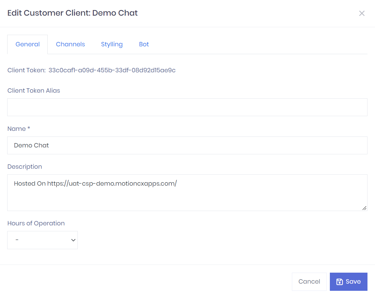
Customer Client General Settings
Add/Edit Customer Client > Channels
The Channels tab contains the basic connectivity and availability options for the customer client.
-
Interaction Channel - Select the bot channel that will be used to provide chat services to the client.
-
Online Monitor Queue - The queue to be monitored for the online indicator function in Javascript. This is typically the primary queue agents will receive chats from this customer client.
-
Maximum Queued Interactions - If the Online Monitor Queue has more than the specified number of interactions in queue, the client will report as offline until the number of queued interactions is less than the configured value.
-
Maximum Logged In Agents - If the selected Online Monitor Queue has less than the specified number of users logged in, the client will report as offline until the number of logged in users is greater than the configured value.
-
Enable Shake Animation - If enabled, the client badge icon will perform a “shake” animation when a new unread message has been received.
-
Enable Sound Notification - If enabled, a notification sound will be played by the client when a new unread message has been received.
- Sound Notification - When Enable Sound Notification is enabled you can upload a audio notification file that the client will play when a new unread message has been received.
-
Enable Adaptive Card - If enabled, an Adaptive Card will be displayed when the client is first displayed.
- Customer Information Adaptive Card - This is a code block to insert an Adaptive Card JSON template. For more information about adaptive cards, see https://www.adaptivecards.io.
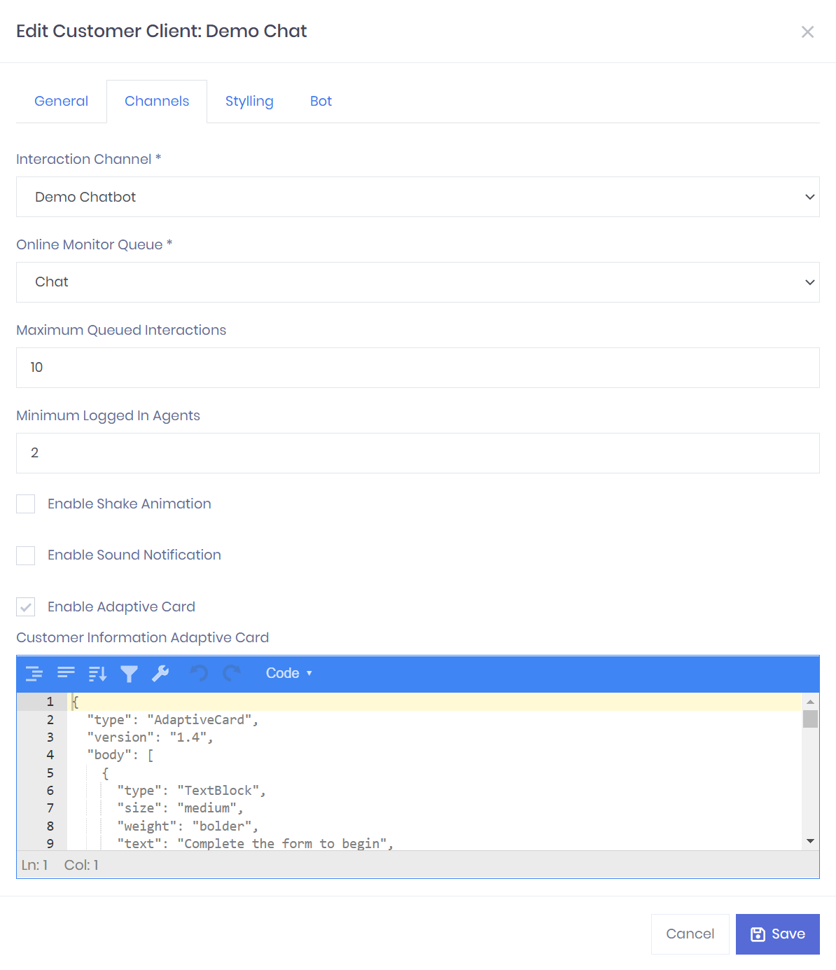
Customer Client Channels Settings
Add/Edit Customer Client > Styling
The Styling tab contains the options to customize the look and feel of the customer client.
-
Chat Header Title - This required field defines the text displayed in the client title bar.
-
Chat Header Logo - You can optionally upload an image file to be displayed in the client title bar beside the Chat Header Title.
-
Chat Avatar Image - The avatar image to be displayed to users for any messages sent from a bot or agent.
-
Chat Button Image - The image that is displayed for the chat badge when the client window is minimized.
-
Chat Button Image (Hover) - An optional image that will replace the Chat Button Image when a user hovers over the chat badge with their mouse.
-
Enable Customer CSS - This is an advanced feature that allows you to replace the CSS file used for styling the widget. This allows for complete control of the widget display, but is only recommended for advanced users experienced with CSS coding. The base CSS file that can be modified is available HERE.
-
Custom CSS Path - Use this option if you want to host the custom CSS file on your own service. If selected, enter the fully qualified path to the CSS field in the Path input field.
-
Customer CSS File - Use this option if you would like to upload a custom CSS file to be hosted in the MotionCX platform. Utilize the file upload to choose and upload your file.
-
-
Basic Style Config - This code block contains the basic style options that do not require custom CSS code to modify. The properties are defined using JSON syntax. The following properties are available:
-
openButtonZIndex – Integer value of the Z-index of the chat badge button. Used to ensure visibility of the badge among other element layers when the client is embedded in an external site.
-
chatPopupZIndex - Integer value of the Z-index of the chat window. Used to ensure visibility of the badge among other element layers when the client is embedded in an external site.
-
enableHover – Boolean value. If true, the hover image will be displayed when a user moses over the chat badge button
-
shadowMainButton - Boolean value. If true, a basic drop shadow will be displayed below the chat badge button
-
positionX – String value. The X-axis position of the lower right corner of the chat badge and window from the right side of the page.
-
position - String value. The X-axis position of the lower right corner of the chat badge and window from the right side of the page.
-
chatPopupWidth - String value. The width of the chat window.
-
chatPopupHeight - String value. The height of the chat window.
-
chatHeaderBackgroundColor - String value. CSS color code for the background of the Chat window title bar.
-
chatHeaderTextColor - String value. CSS color code for the title text in the Chat window title bar.
-
{
  "openButtonZIndex": 999,
  "chatPopupZIndex": 999,
  "enableHover": true,
  "shadowMainButton": false,
  "positionX": "32px",
  "positionY": "64px",
  "chatPopupWidth": "360px",
  "chatPopupHeight": "640px",
  "chatHeaderBackgroundColor": "#000000",
  "chatHeaderTextColor": "#ffffff"
}- Adaptive Card Host Config - This code block allows for customization of styling and other UI options for any Adaptive Cards displayed in the client. The configuration is defined in JSON syntax. For more information about this configuration, refer to the Microsoft Adaptive Cards documentation. For a configuration example, view the Sample JSON block.
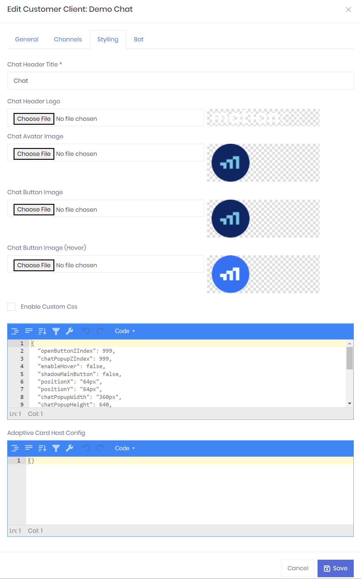
Customer Client Styling Settings
Add/Edit Customer Client > Bot
-
Inactivity Timeout - Integer value (in minutes) specifying when interactions will be disconnected for inactivity by the user or agent in a live chat scenario. Notifications in the client will be displayed warning users of an inactivity disconnection 1 minute prior to expiration, and a disconnection message will be displayed once the specified time has elapsed.
-
Bot Message Styling - This code block is a JSON object that defines the styling for the messaging conversation in the client. A list of all properties available for styling are located HERE. Any styles not defined in this block will use the default values defined on the link above.
{
  "suggestedActionLayout": "stacked",
  "suggestedActionBackground": "#ffffff",
  "suggestedActionTextColor": "#0076be",
  "suggestedActionBorderWidth": 2,
  "suggestedActionBorderColor": "#0076be",
  "suggestedActionBorderOnHover": "#0063a4",
  "suggestedActionBorderRadius": 10,
}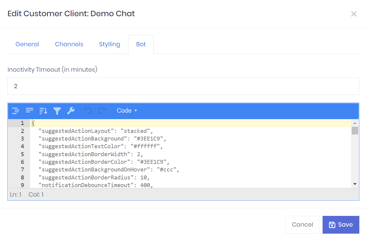
Customer Client Bot Settings
Updated 11 months ago
